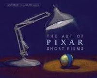
After studying posters from several short films i have discovered that there are many convetions specific to a poster, for example most posters have the minimum of information, they are mostly used as an attention grabber. For example they use a big picture to grab your attention and use bold colours they often have just the title above as a source of information, this is used so you look up information about the film and will often link to a webpage to the film, we are doing this with the magazine spread. On our poster we will have the release date of the film the title, the webite adress and a still shot from the film, as this is the most common convention of the poster.
the aim of the poster is to grab someones attention, it is said we only have 11 seconds, this means the writing has to be bold
good - use the work we looked at last year to explain how an audience will respond - you need evidence of semiotics, semantics, signifiers and pragmatics as well as on-line, off-line and verial advertising instruments - look at Blaines blog - OR look at the work i have uploaded onto the school system
ReplyDelete